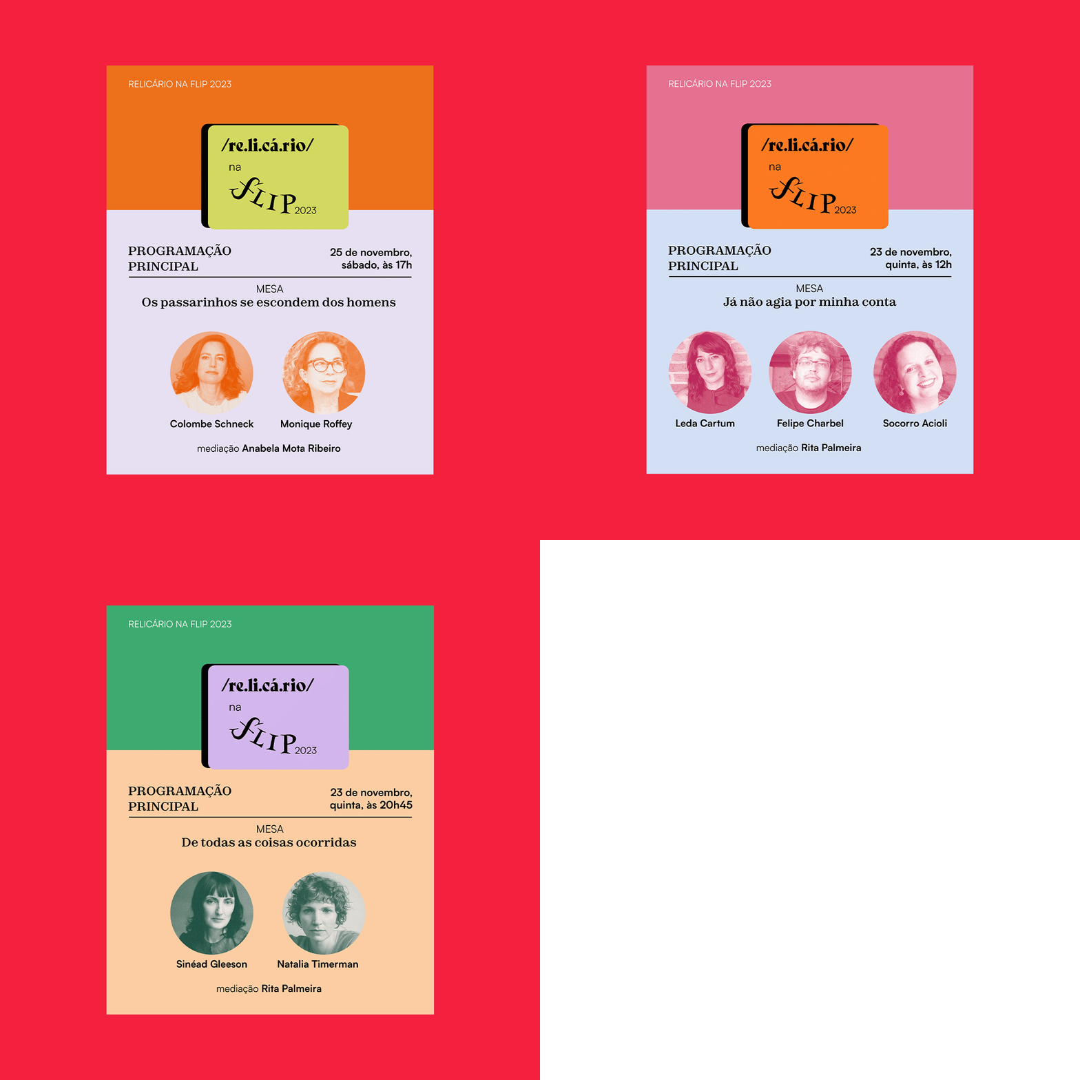
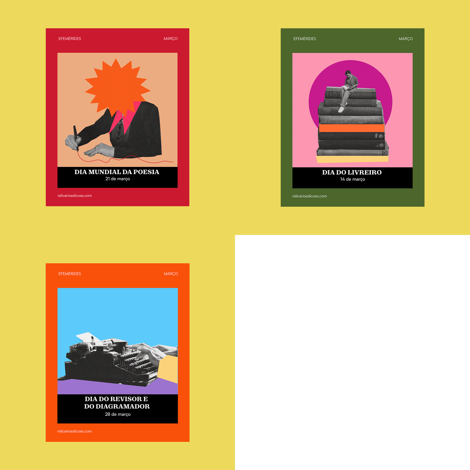
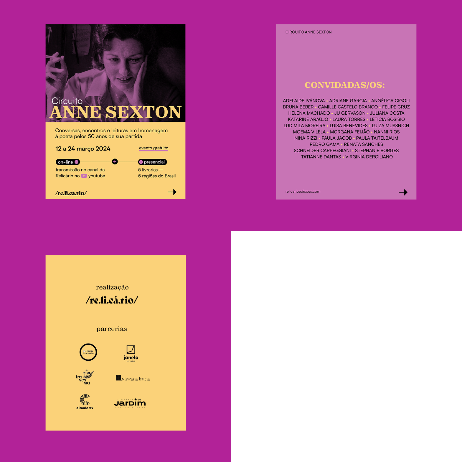
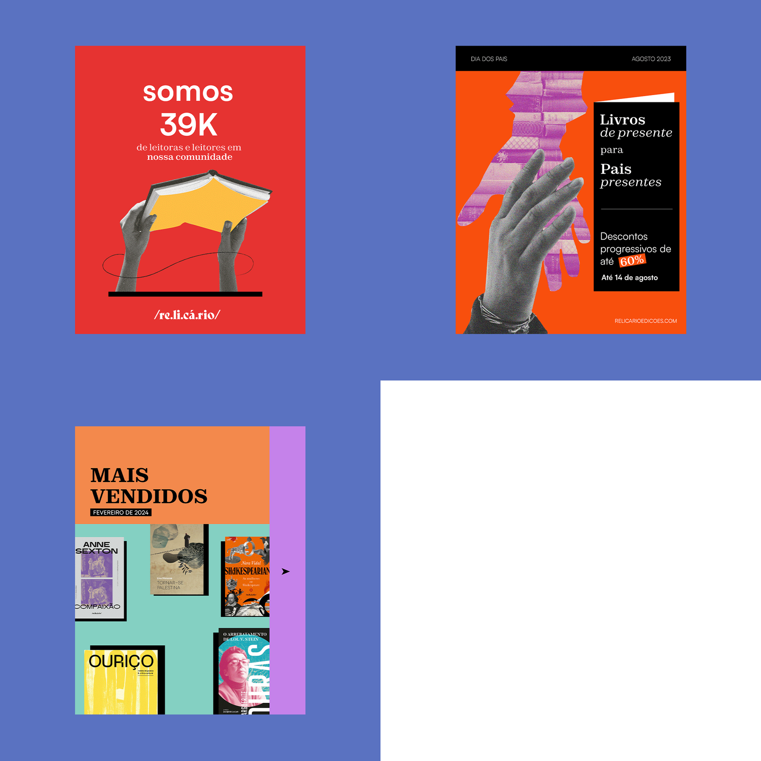
[PT] O livro é, por excelência, o relicário das letras. Essa é a nova identidade visual da Editora Relicário, de Belo Horizonte, Brasil. A qual sou colaboradora como designer gráfica e editorial há 4 anos.
A marca foi criada ano passado (2023) com muito cuidado, entre trocas colaborativas e criativas com a Maíra Nassif, editora da Relicário. O desenho do logo é inspirado na entrada de dicionário, as verbetes, ideia que veio da Maíra, a pessoa que criou a editora, por isso, a nova marca conversa ainda mais com toda trajetória da Relicário, afinal esse trabalho é sobre livros, palavras e literatura.
O logo nasceu de uma tipografia reinventada, foi desenhada praticamente do zero, com forma e peso marcantes, pensando tanto na importância dessa marca ser vista e reconhecida, quanto na sua legibilidade em tamanhos reduzidos.
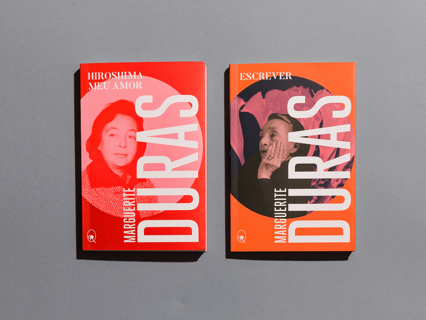
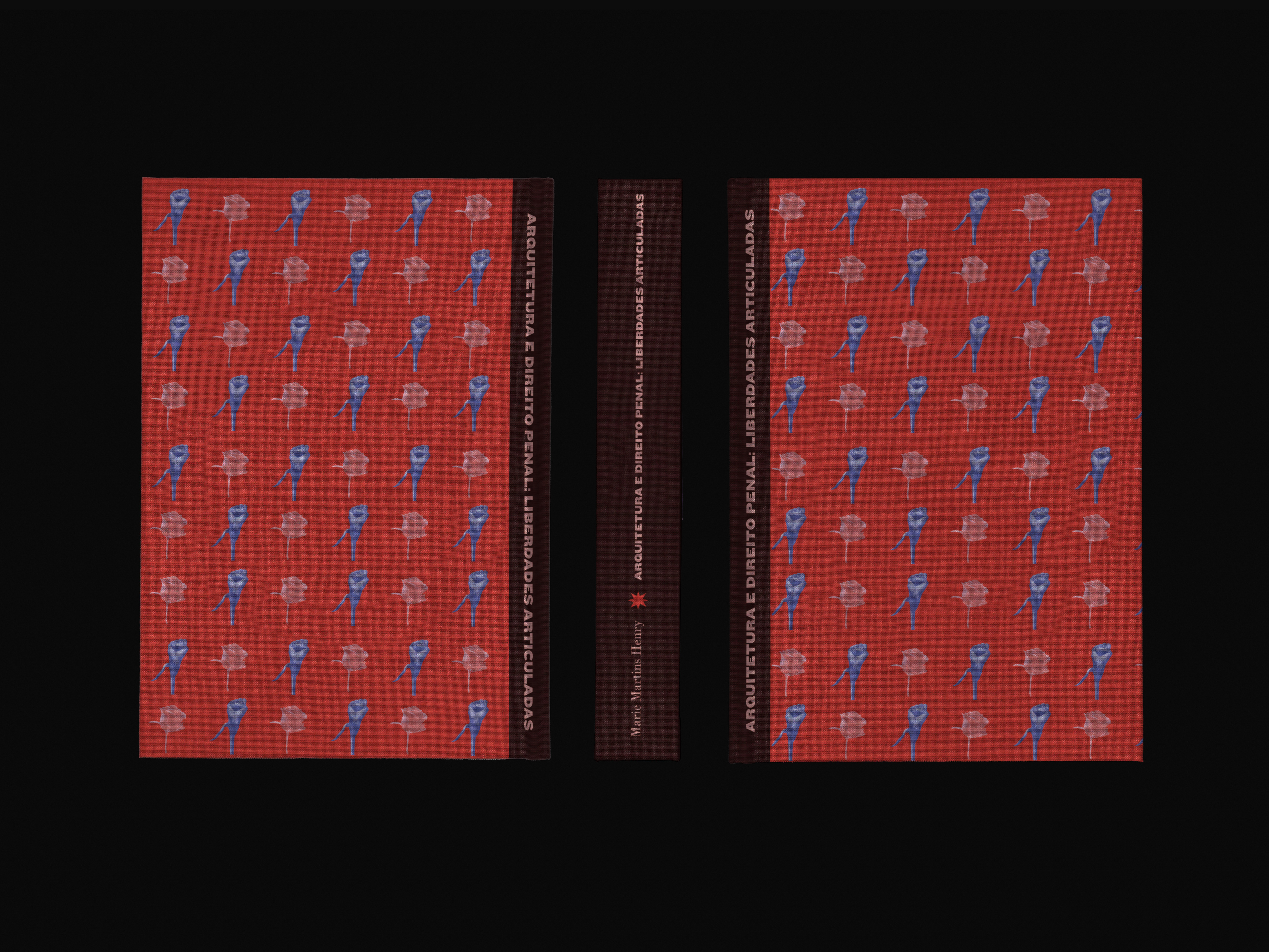
As capas aqui apresentadas foram também desenvolvidas por mim para a editora.
As capas aqui apresentadas foram também desenvolvidas por mim para a editora.
[en] The book is, par excellence, the reliquary of letters. This is the new visual identity of Relicário publisher, from Belo Horizonte, Brazil. I've been collaborating with them as a graphic and editorial designer for four years.
The brand was created last year (2023) with great care, between collaborative and creative exchanges with Maíra Nassif, Relicário's editor.
The logo design is inspired by the dictionary entry, the entries, an idea that came from Maíra, the person who created the publishing house, so the new brand speaks even more to Relicário's entire trajectory, after all this work is about books, words and literature.
The logo was born from a reinvented typeface, designed practically from scratch, with a striking shape and weight, thinking both about the importance of this brand being seen and recognized, as well as its legibility at small sizes.
I also designed the covers presented here.


OBRIGADA! ¡GRACIAS! THANK YOU
