[PT] "A tipografia no Porto, um livro documental sobre a tipografia de um lugar".
Quando pensamos em tipografia, por que não necessariamente a associamos como um elemento histórico, assim como pensamos na Arquitetura ou Obras de Arte? Por que quando vamos entender a história de um LUGAR, sua construção, sua passagem no tempo, a tipografia não é considerada com devida relevância?
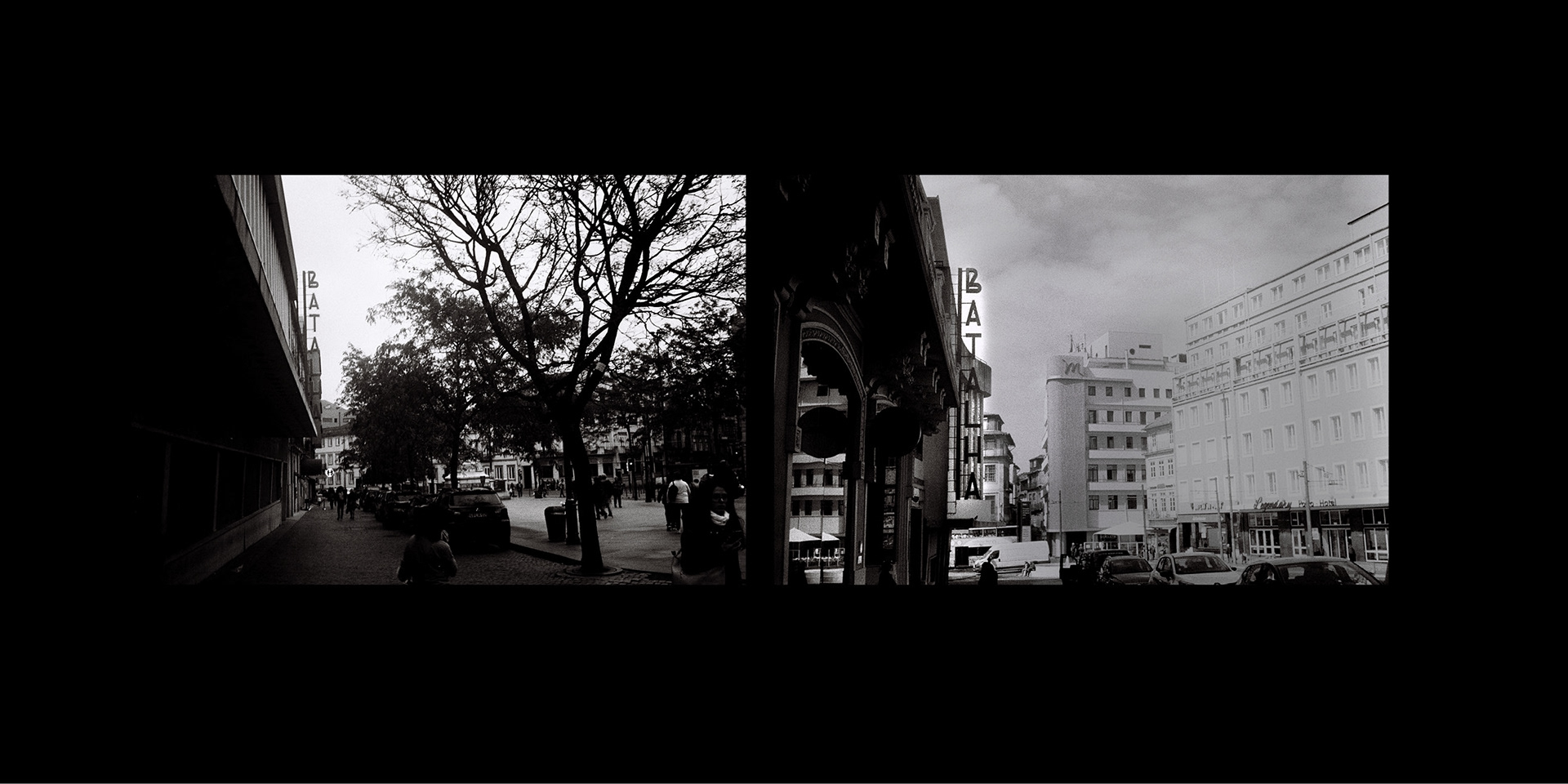
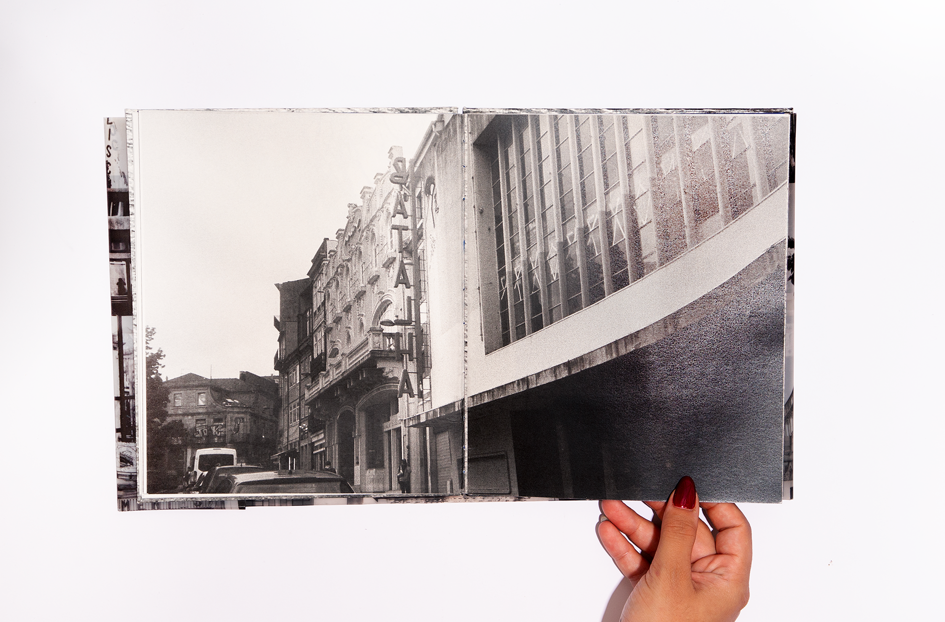
Quando morei na cidade do Porto, em Portugal, algo que sempre reparei e me chamou atenção foi a sua Tipografia de Paisagem. Por isso criei esse projeto editorial, um fotolivro que mostrasse essa passagem do tempo através da tipografia. O livro foi criado em 2019 na disciplina Projeto do Mestrado da Faculdade de Belas Artes do Porto, "Design Gráfico e Projetos Editoriais".
Quando morei na cidade do Porto, em Portugal, algo que sempre reparei e me chamou atenção foi a sua Tipografia de Paisagem. Por isso criei esse projeto editorial, um fotolivro que mostrasse essa passagem do tempo através da tipografia. O livro foi criado em 2019 na disciplina Projeto do Mestrado da Faculdade de Belas Artes do Porto, "Design Gráfico e Projetos Editoriais".
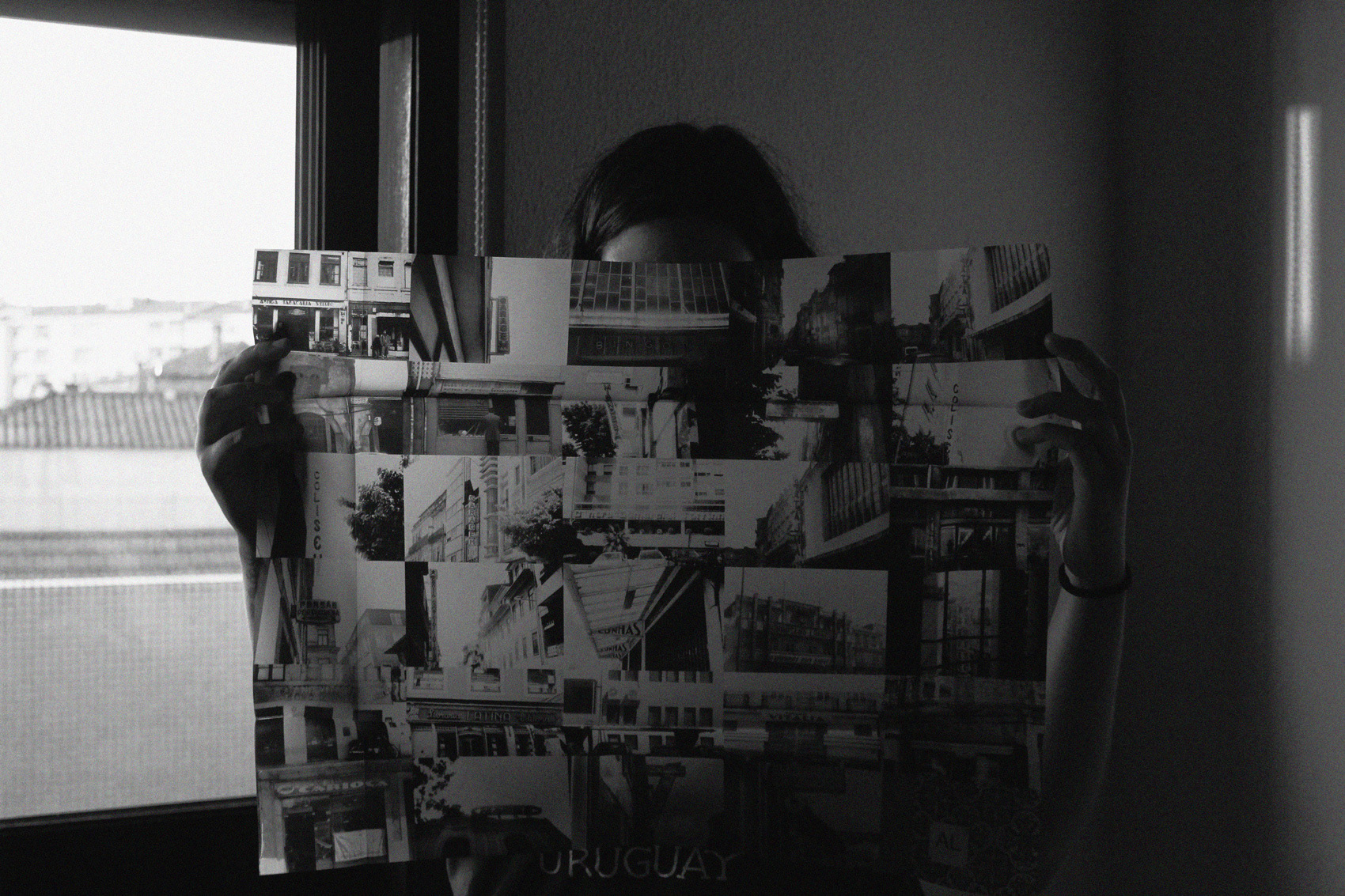
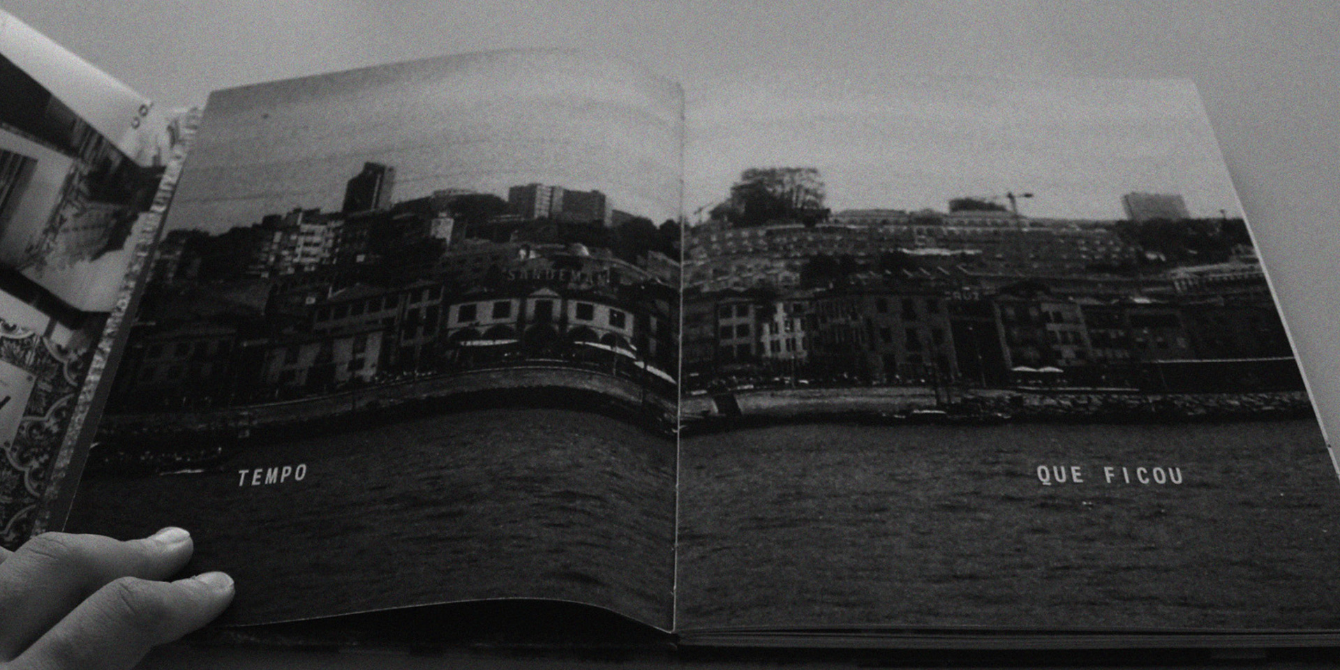
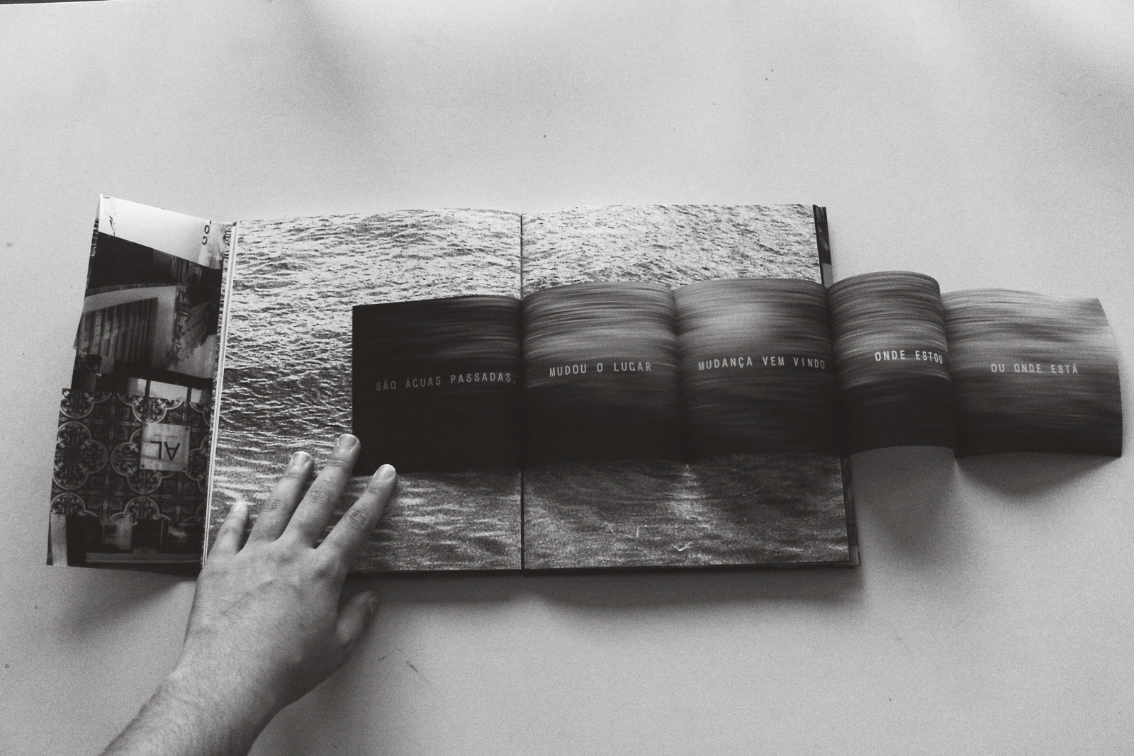
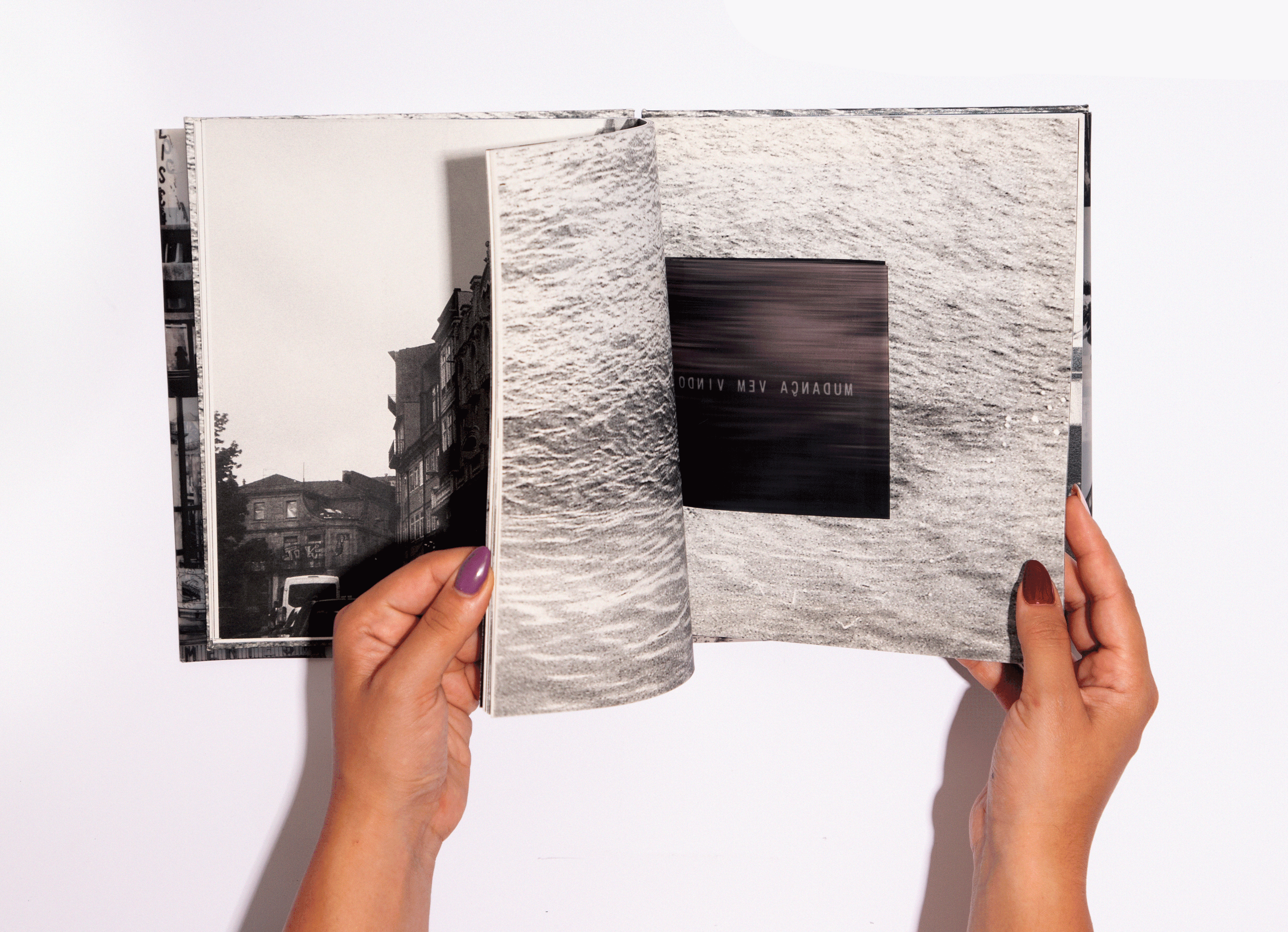
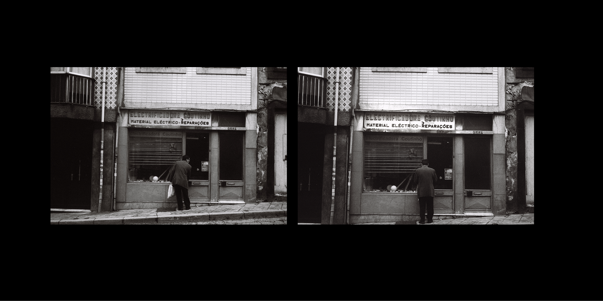
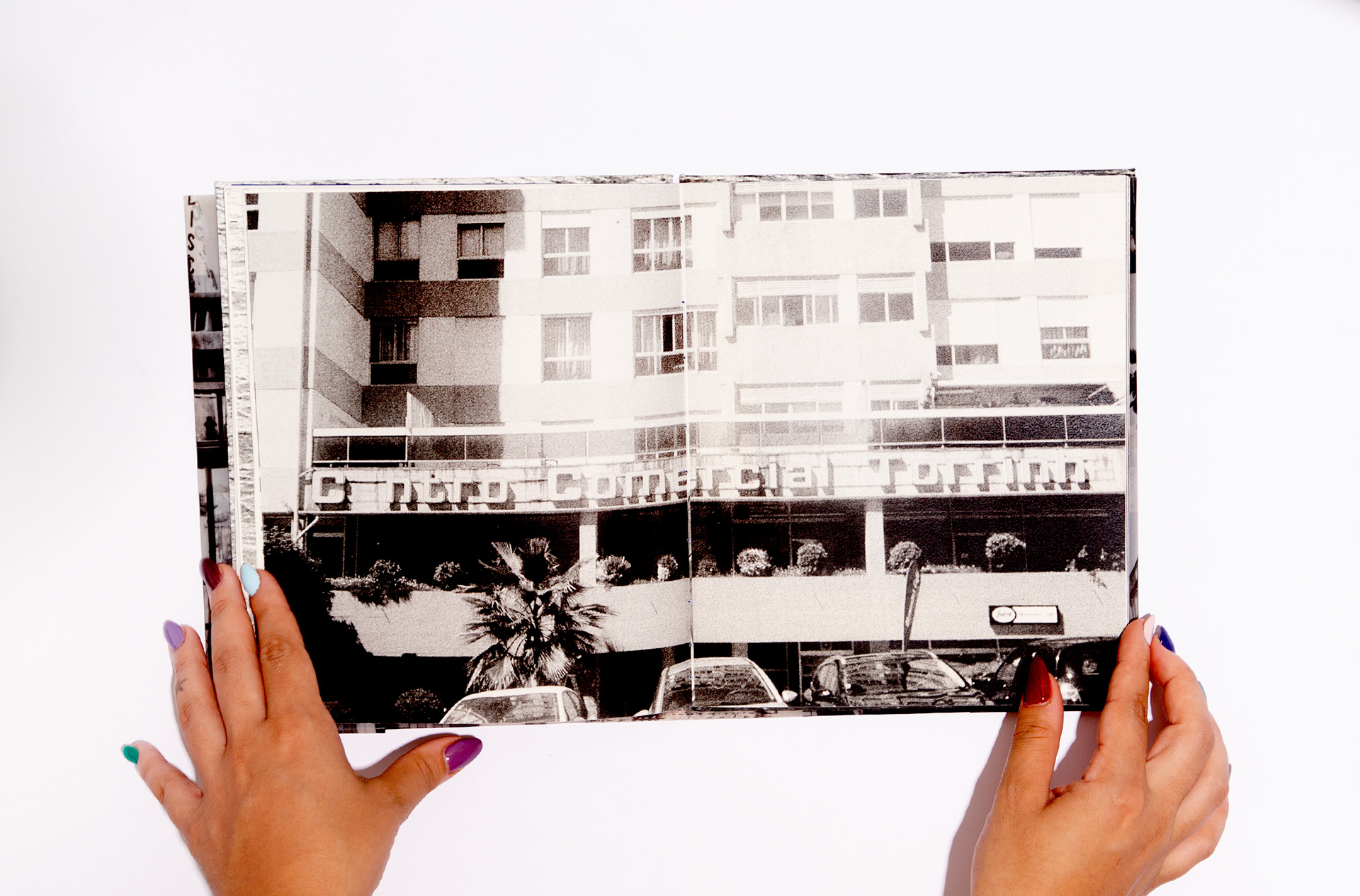
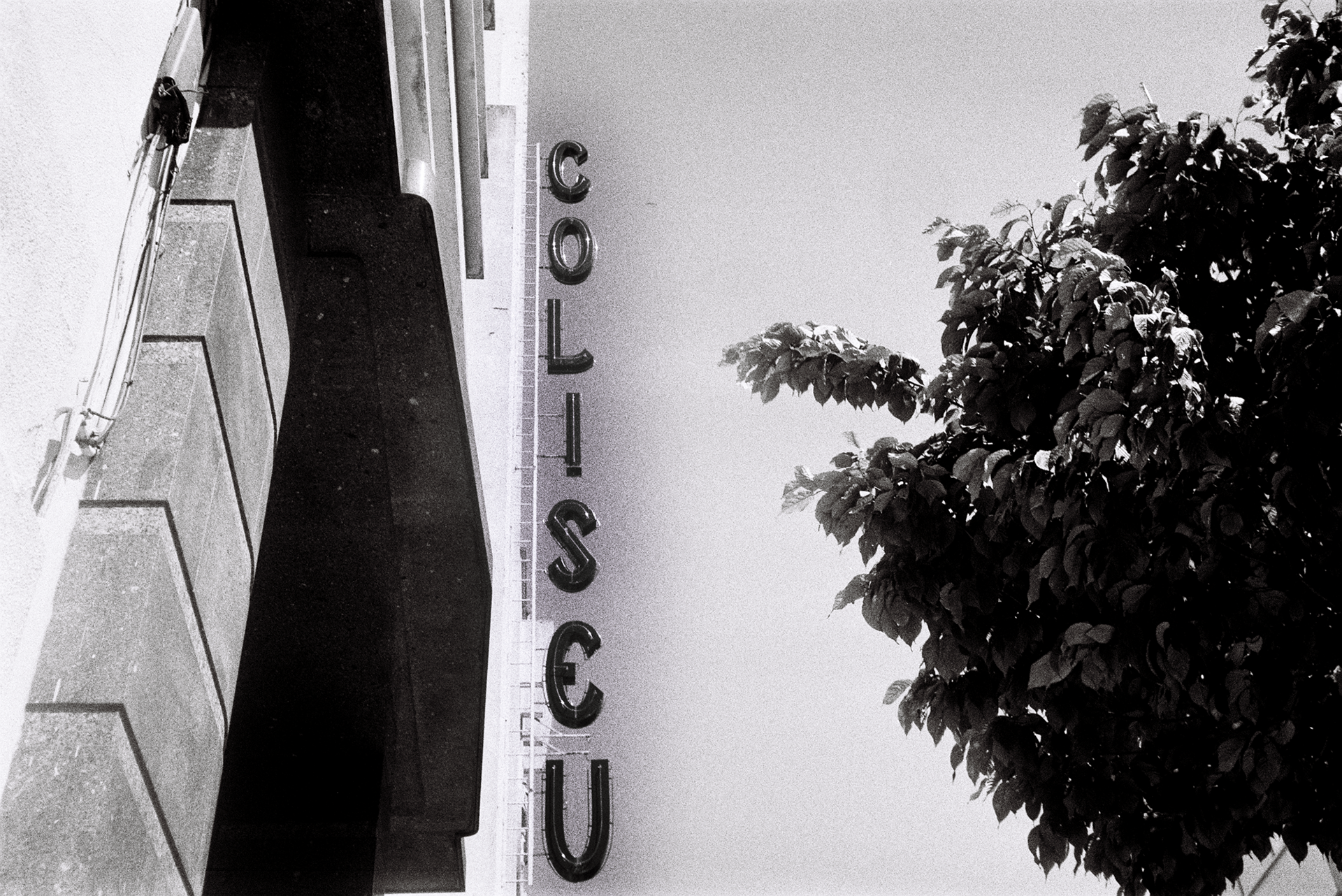
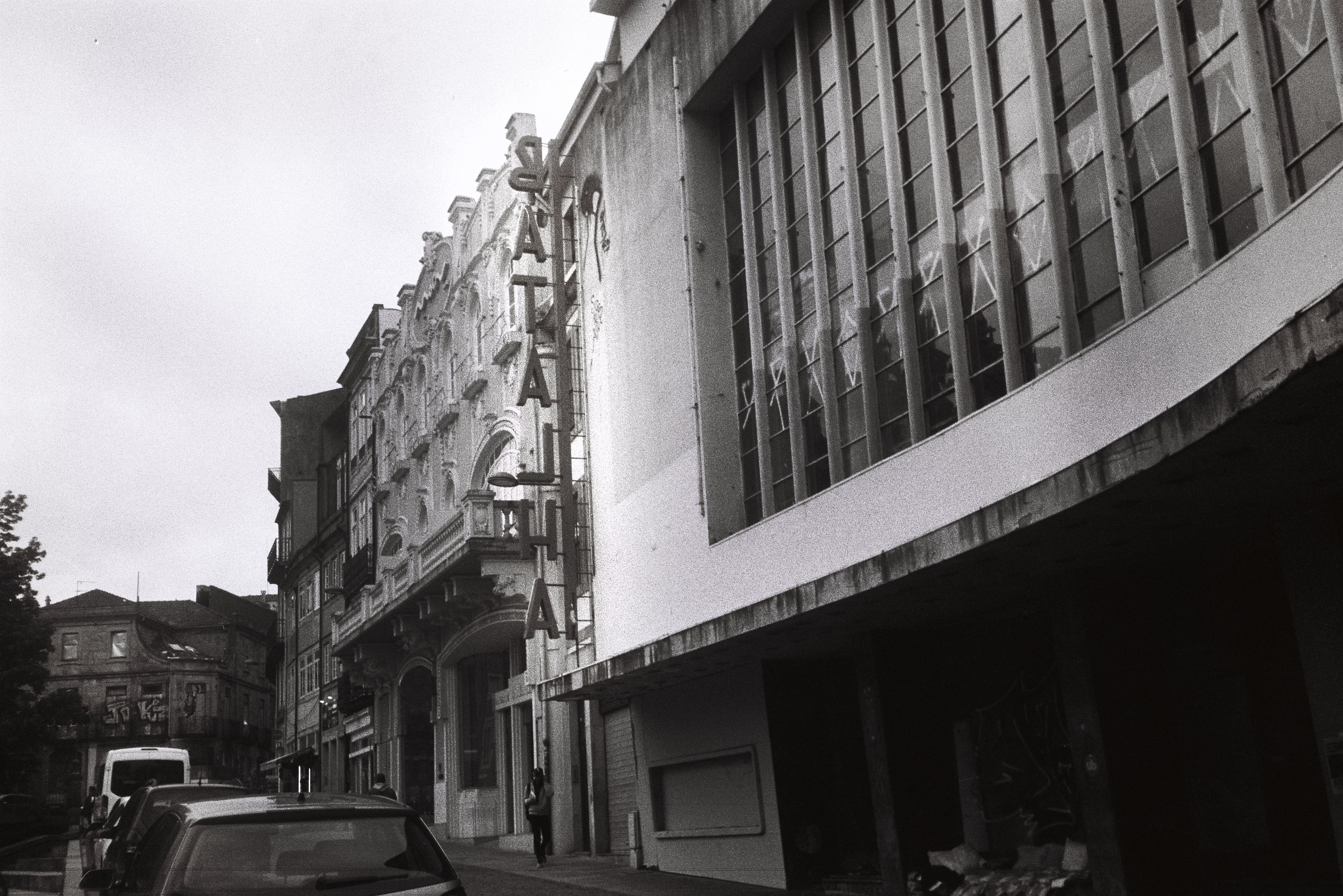
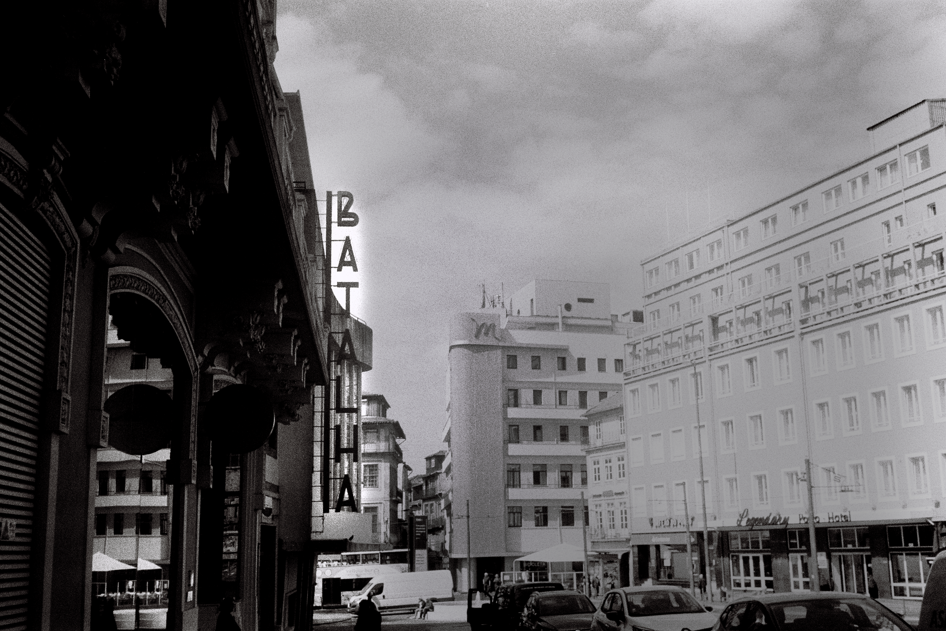
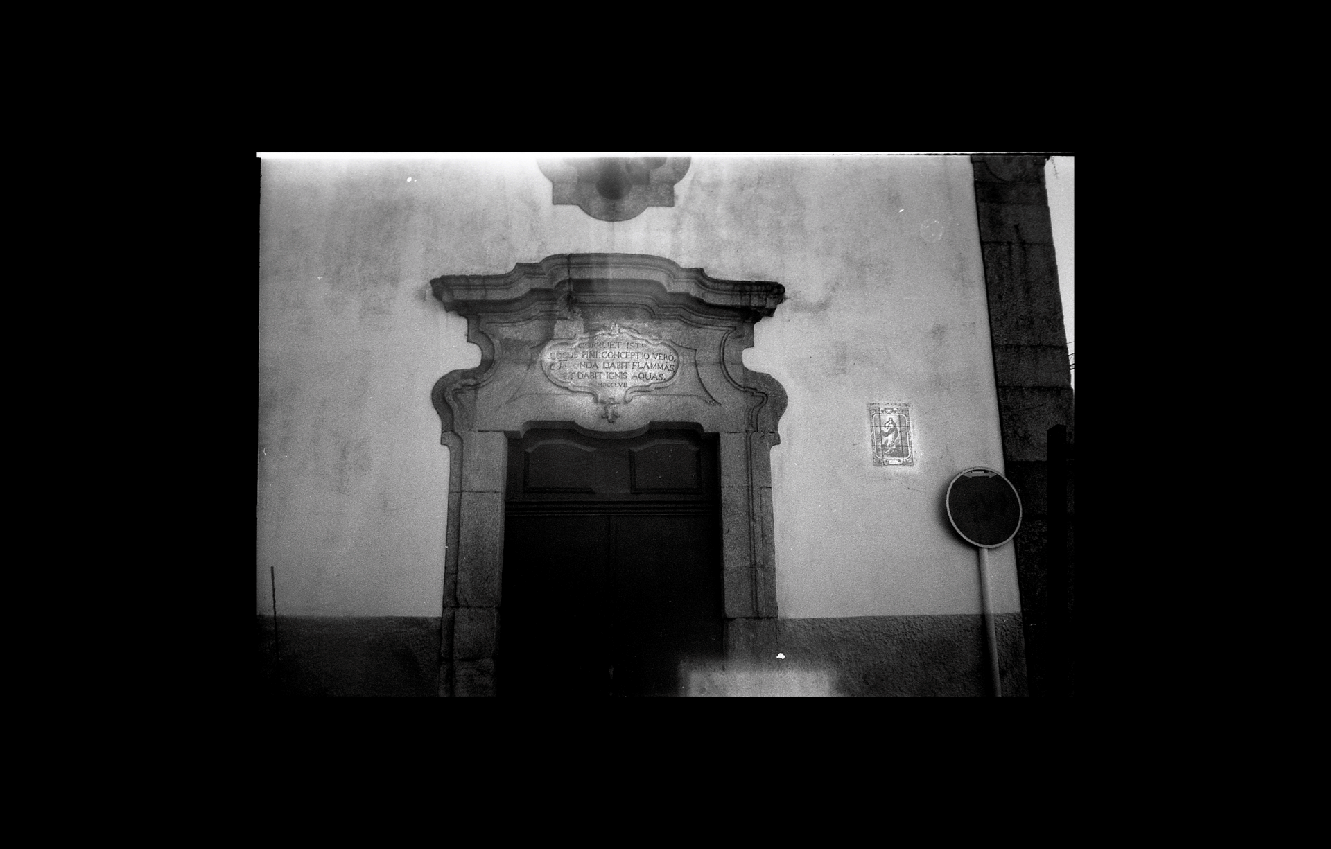
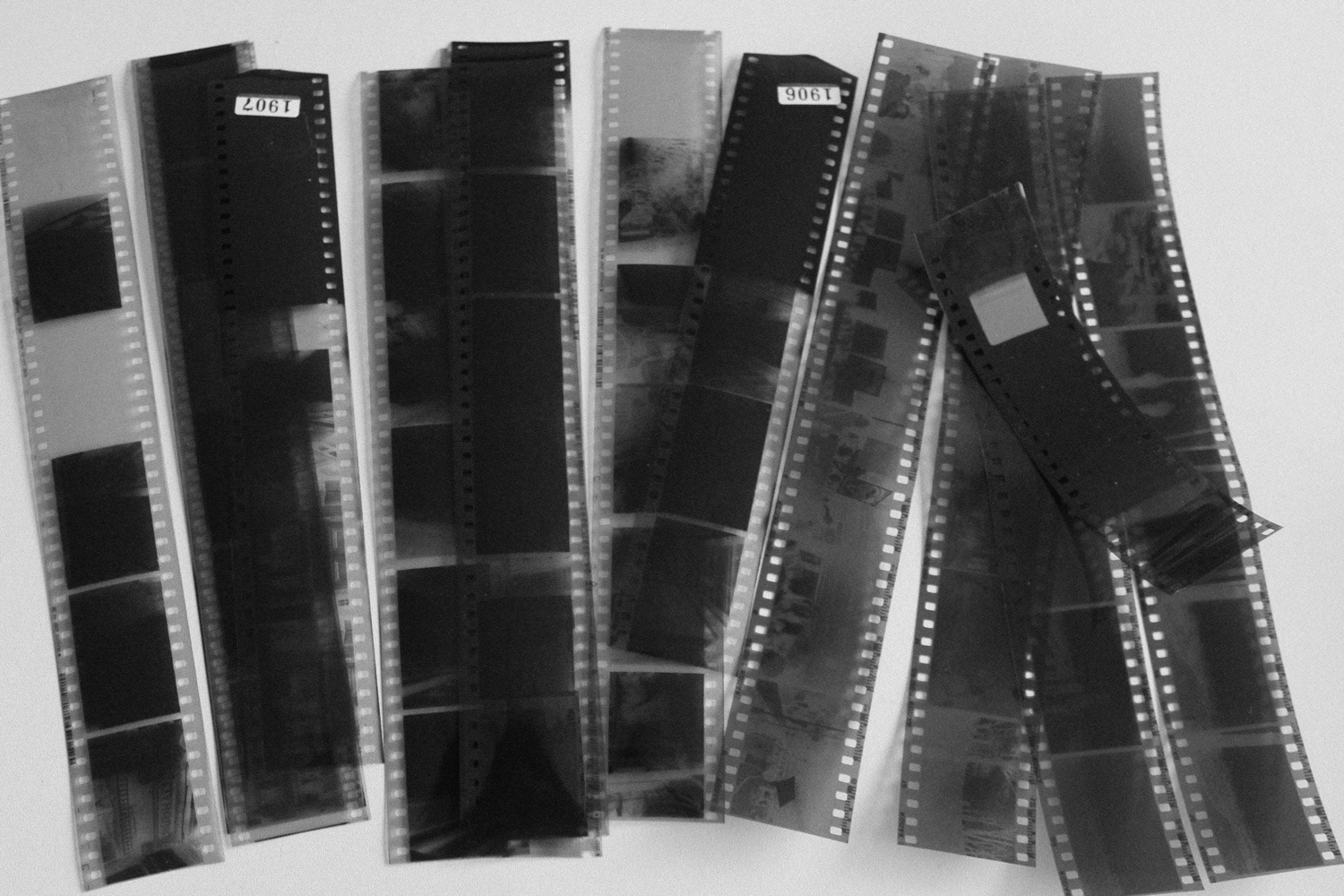
As fotos são em 35mm, filme preto e branco e foram todas tiradas por mim, com uma câmera Yashica MF3 Super. O presente estilo fotográfico é para remeter a lembrança e a fotografia analógica é para deixar o projeto o mais humano possível além de ligar ao tempo, a não necessidade de ver a fotografia no mesmo instante, o tempo é um dos conceitos do livro assim como o rio da cidade.
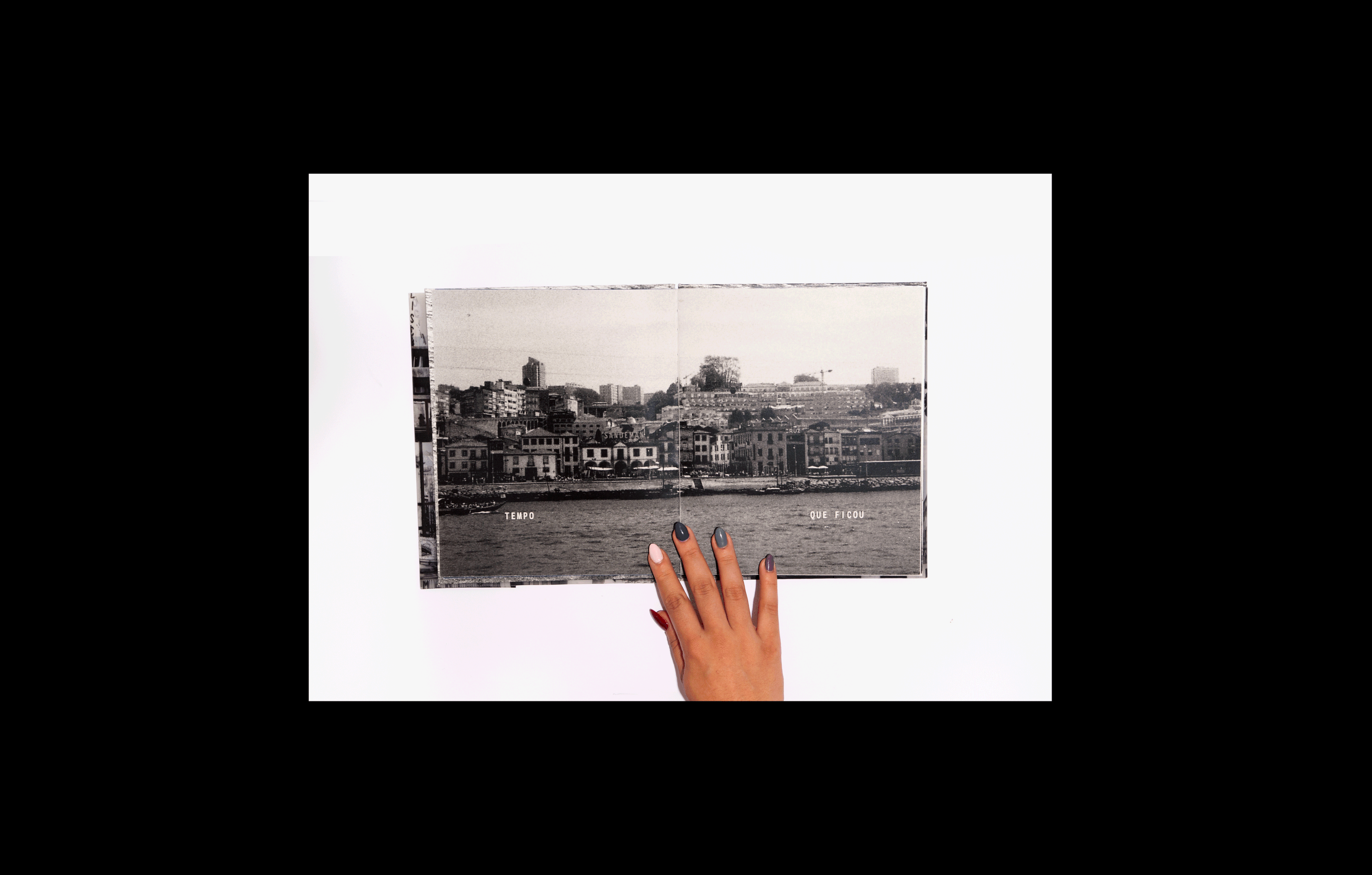
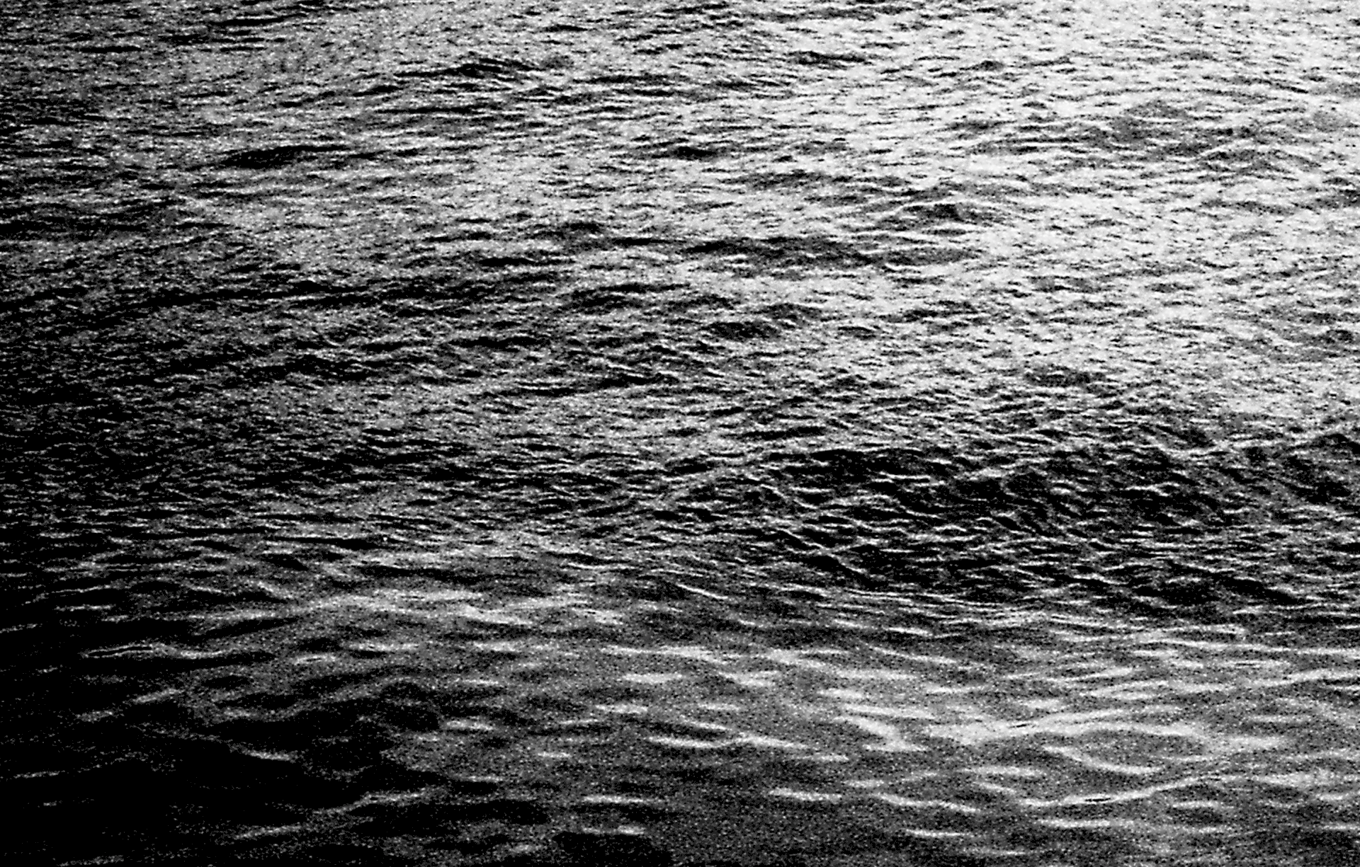
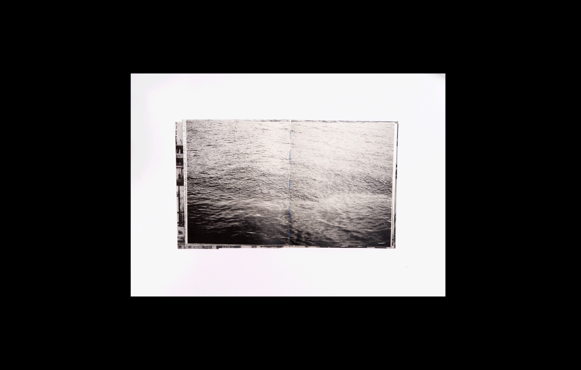
No Porto há um rio, o rio Douro, o terceiro rio mais extenso da península Ibérica. Eu, criadora e curadora deste projeto, trago essa simbologia pois no meu repertório há essa importância do rio como identificação para o LUGAR, no Brasil acreditamos que o rio carrega uma energia histórica bem relevante. Carrega vida, uma forma que se transforma e que faz dele todo dia único. Além disso enxergo o rio como o tempo, em constante mudança, tem seus momentos de calma e outros de tormentas e agitações. E por isso, com essa metáfora eu construo esse livro para refletirmos.
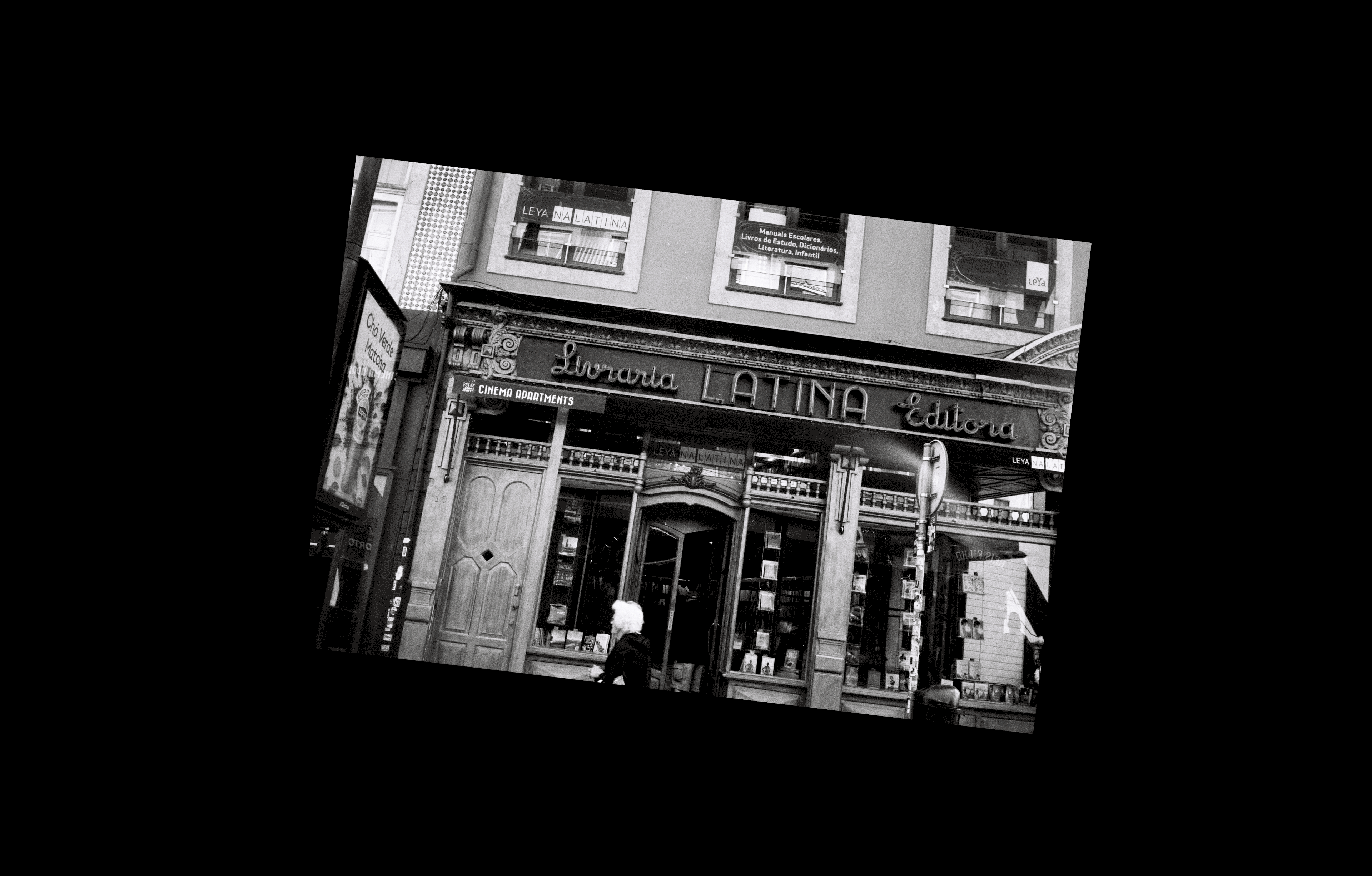
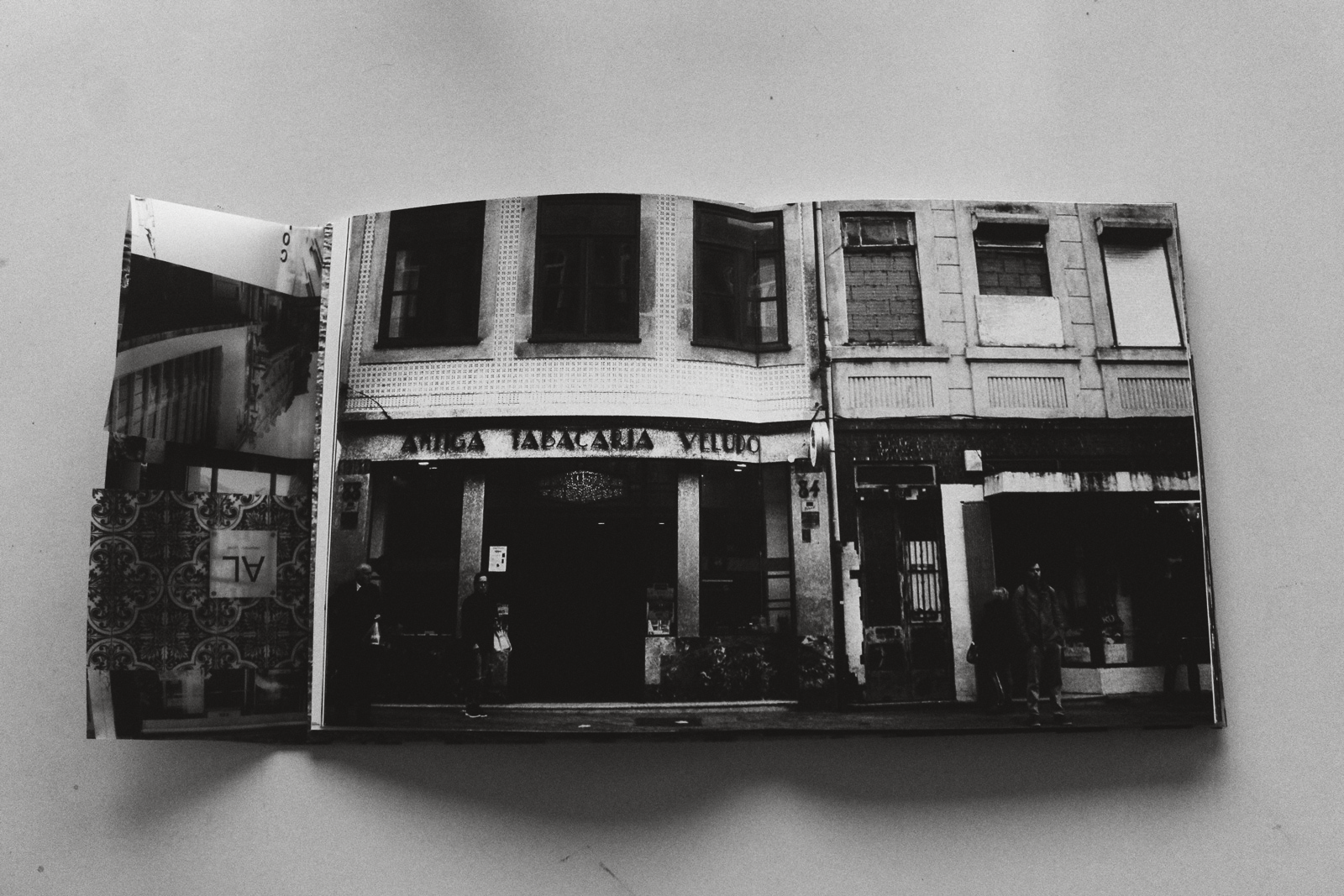
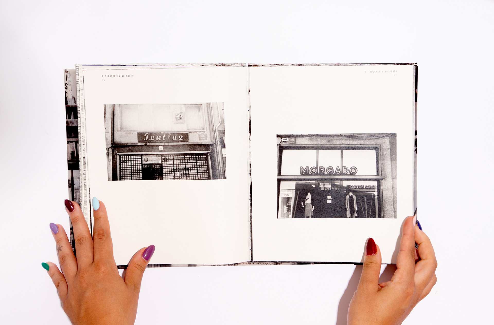
Sem tipografia os lugares não teriam sinalização, não poderiam dizer quem são. E o LUGAR somos nós, a origem das palavras está nos gestos dos corpos e observando a tipografia como essa forma expressiva contínua com o ofício, o desenho da letra consegue transmitir suas épocas, seus momentos e apocalipses.
O livro retrata também a questão da gentrificação na cidade, como ela se modificou com a intervenção das ações humanas e vem tendo em sua paisagem placas de Alojamento local - focando em turistas e pouco na própria população.
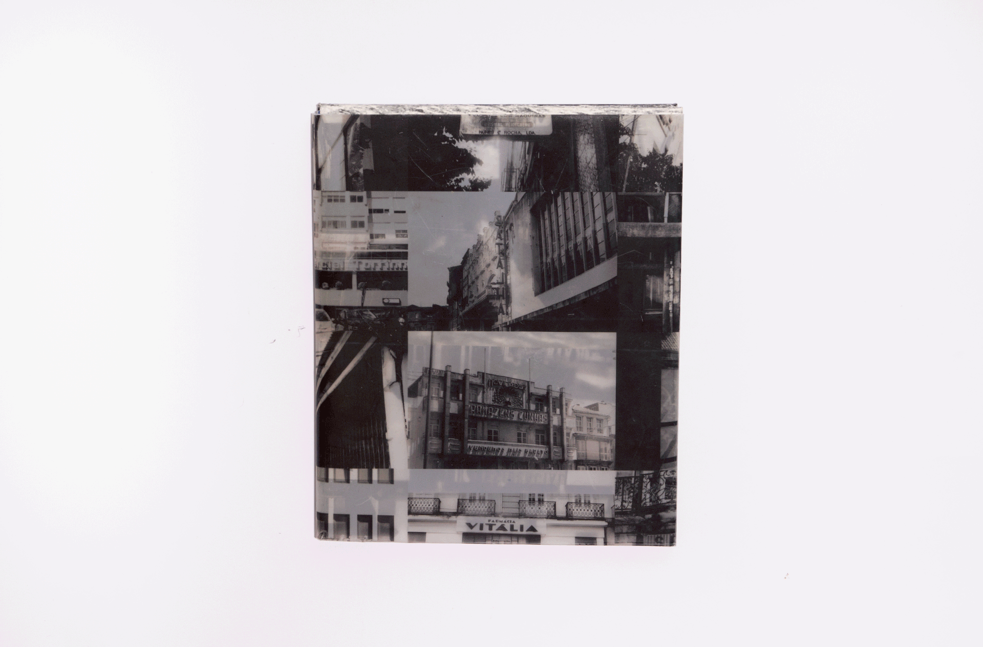
O azul da folha de guarda e as linhas da encadernação visível aparecem sutilmente para remeter as águas e ao Porto. o azul lembra tanto o LUGAR porto e sua imensa conotação.
A sobrecapa, em papel poliéster é para remeter o filme analógico. Essa bela transparência da fotografia em negativo, o que pode ser um cartaz facilmente. E a tipografia usada no texto introdutório e no fólio do livro é uma sans serif com curvas mais orgânicas e em caixa alta, pois o uso da caixa alta era muito frequente em sinalizações.
***
[EN] “Typography in Porto, a documentary book about the typography of a place”.
When we think of typography, why don't we necessarily associate it with a historical element, as we do with architecture or works of art? Why is it that when we go to understand the history of a PLACE, its construction, its passage through time, typography is not considered with due relevance?
When I lived in the city of Porto, in Portugal, something I always noticed and drew my attention to was its Landscape Typography. That's why I created this editorial project, a photobook that would show this passage of time through typography. The book was created in 2019 as part of the “Graphic Design and Editorial Projects” Master's course at the Faculty of Fine Arts of Porto.
The photos are 35mm, black and white film and were all taken by me with a Yashica MF3 Super. The photographic style is intended to evoke memories, and the analog photography is intended to make the project as human as possible, as well as linking it to time, to not needing to see the photograph at the same moment; time is one of the book's concepts, as is the river.
In Porto there is a river, the Douro, the third longest river in the Iberian Peninsula. I, the creator and curator of this project, bring this symbolism because in my repertoire there is this importance of the river as an identification for the PLACE, in Brazil we believe that the river carries a very relevant historical energy. It carries life, a form that transforms itself and makes every day unique. I also see the river as the weather, constantly changing, with its moments of calm and others of storms and upheavals. And so, with this metaphor, I put together this book for us to reflect on.
Without typography, places wouldn't have signs, they wouldn't be able to say who they are. And the PLACE is us, the origin of words is in the gestures of bodies and by observing typography as this continuous expressive form with the craft, the design of the letter manages to convey its eras, its moments and apocalypses.
The book also portrays the issue of gentrification in the city, how it has changed with the intervention of human actions and has had local accommodation signs in its landscape - focusing on tourists and little on the population itself.
The blue of the title page and the lines of the visible binding appear subtly to refer to the waters and Porto. the blue is so reminiscent of the PLACE porto and its immense connotation. The cover, made of polyester paper, is a reference to analog film. That beautiful transparency of the negative photograph, which could easily be a poster. And the typeface used in the introductory text and on the book's folio is a sans serif with more organic curves and in upper case, as the use of upper case was very common in signage
Encadernação: Diana Fernandes
Fotografias em 35mm: Tamires Mazzo
Fotos do projeto para portfólio: Tamires Mazzo e Tinho Sousa
OBRIGADA! ¡GRACIAS! THANK YOU